Friday 10 December 2010

Making The Double-Page Spread

For my double page spread i chose to do an interview with what is portrayed to be a on trend, and influential Indie-Pop artist. In my research i discovered and recognised that the main feature within any music magazine was more than likely always an interview with a popular artist of that genre they are representing. I therefore carefully linked to the main luring and engaging feature on my cover (the interview with this on demand artist), to my double paged spread.
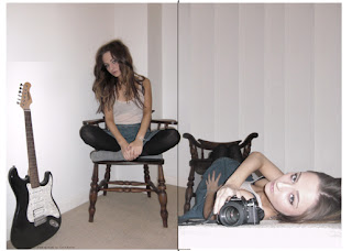
I edited the one image i took of my model in Photoshop using the 'Magnetic Laso' tool to remove the background of the image. I chose this image as i felt it was one of the strongest i took and feel next to the second image i shows gives a good contrast of angles and shots between the two, for both to be interesting and intriguing images yet put next to each other more.
I did this to then blend in another image i wanted to include to create a flowing and open double-page spread, which didn't cut in the middle. I therefore started to cut in part of the other background which i copy and pasted, and drag them over to this image to give the effect of it being one image.
I also chose to slightly overlap the image, onto the next page again to create a look of not segregating them as two separate pages but linking them as one larger one, in which i wanted to purposely create for a strong, open feature. This was in the models knee, the part of the picture which went most the the right, carefully placed to ensure the models face or outfit wasn't cut through the middle which could when printed cause a bad look but subtly with the knee to still fulfill the overlapping technique.
Once completed the photography for the double-page spread was done. I am very pleased with how this looks and feel it is a successful start to the Pages.

I then went on to add the iconic codes and conventions again. There may not have been as many within the middle pages of the magazine but even so each that was added, contributed to the realism of the magazine, giving it more of a professional look. This included a photographer label, to the images, in which all magazines use as a promotion for the photographer or even sometimes for legal reasons to name who took the image. I put this at the bottom of the page, as i felt it was the best position for it. I also added a page number one of the most common and traditional conventions of a magazine, again to add to the over realism of my magazine as an existing product. However to develop this and to add to the magazines house style i put the number on a slight slant. I feel tiny details like this, complete the page as an overall good styled spread.
I then added the Heading of the interview. I placed this in a space on the left side of the page. I did this to ensure it wouldn't overlap the statement photography and the model, and would also join the two pages together with the heading on one side and the interview on the other. I chose a plain font which was carried out throughout the magazine to create the house style and to add to the simplistic effect and look. I used an engaging headline, including words such as 'unfolds' also underlining this to put focus on this being a big and important thing making the reader want to read on with the interview. Again i filled in random spaces within the letters to the heading to show how it is the theme and iconic feature for the magazine, also being automatically linked to them when recognised. 
And finally i added the interview. I completed the interview in a question answer manor, which after looking through my research was a popular choice for most magazine to create a good, flowing interview. The interview included a subheading which again engaged the  reader and made them want to read on with in the interview, by including teasers such as, 'talks to CROSSOVER about her debut album' and 'her past secrets'. Also giving a brief summary of the artist for those who have bought the magazine for other purposes and not knowing the artist, or simply as an introduction to the interview. A subheading is another iconic convention of a magazine which is used in all interviews now. I related my tone of voice and language also to my target audience. From research a more laid back, conversational, informal tone of voice would engage them more and be something which is more regognised and admired for them. I also had to ensure, like in a real magazine production things such as spelling, grammer, and suitability were all relevant and checked.
When going through my research within magazine interviews i found collums were the most iconic and traditional forms of layout.
Therefore i also used this layout within my interview. This was again to create the best look of which an existing magazine would have, making my own look more realistic and manipulating the famous codes and conventions to my advantage to do so.
I also used more subtle codes and conventions, within my magazine interview in which magazine readers would be most familiar with and fins suitable for any interview. This was differentiating the interviewing questions and the answers by the questions most commonly being in bold. Also by adding a larger piece of text, usually a quote that was said within the interview again to lure in a ready to engage their attention and make the want to read it and finally adding to the realism a reference at the end of the interview to where the album being spoken about can be bought, in this case iTunes.

 (small piece of detail included within the copyright logo being put next to the iTunes tag for realism)

Here shows my final Double-page spread. I am very happy with this outcome and it is exactly how i wanted to portray the Indie-Pop style. I am also confident my interview is engaging and relevant to the style and genre, and my images are strong and influential.


Wednesday 8 December 2010

Making The Cover

I chose the name 'CROSSOVER' for my magazine. I was definite with this decision and didn't have any other options to decide with. When carrying out my research I found the word crossover used within a magazine. I automatically found it catchy yet sophisticated. I researched more within the word and discovered it was a musical term meaning ''Crossover is a term applied to musical works or performers appearing on two or more of the record charts which track differing musical tastes, or genres.'' After discovering this and choosing my hybrid of Indie and Pop as a genre for my magazine I found it a perfect name and suit to its crossover genre.
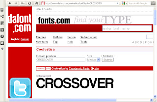
The first thing I created when making my Cover of my magazine was the Mast head. For this I used a font website called www.dafont.com, this gave the magazine a more realistic look with professional fonts used by other magazines, especially ones similar within the same sort of music genre.
Above shows my final choice of font to use for my MastHead, (font name-coolvetica). I chose this one as I feel it adds to the simple yet effective look I am going for, in which I feel would represent Indie-Pop, I also made the letters all in capitals. This was done purposely to create a statement and dramatic masthead, in which would become iconic for my magazine therefore having to be projected as strong and superior when competing with other magazines in distribution and sales.
 However I was very unsure about what sort of font I wanted initially and Below shows experiments of fonts I tested with the name before finalising on this one. They were all fonts that I liked, or that caught my eye on www.dafont.com, which would be a good element to have in your own masthead, usually being the most visible part to a magazine when stacked, therefore arguably the most important. But I feel the one i have chosen is most suitable and the strongest option.
One I had chosen my font, I decided to use a White colour scheme. Although I felt this lacked the splash of colour it needed yet didn't want a coloured font. I therefore decided on creating a coloured background within random sections of the letters. I chose pastel colours for this, again linking to the laid back style of the Indie-Pop genre, with more dimmed and un-dramatic colours.
I felt very happy with this as the representing the title of the magazine and used this as the starting point for the Cover page. After deciding on the Image for the Cover page in my 'Photography for The Cover' section I then put my two key starting elements together to start to build the cover as a professional magazine page.
I then felt that adding the iconic codes and conventions of a real magazine would tie together the page as a cover, and create the realistic look in which I am aiming for as my magazine as a product. For example from my research one of the most iconic things included on a cover of all types of magazine was an issue number and price. I wanted to portray my magazine as an already successful product rather than a new upcoming magazine therefore thought carefully about the issue number deciding on 521. The price was also a major element, as from my questionnaire the correlation between younger people wanting a lower price became apparent. And after choosing a younger age range as my target audience I felt the price of £1.89 was a perfect balance, a fair enough price to compete with other high end music magazine and be affordable for them yet be suitable enough to ensure profit and revenue was strong. 
I chose to put the price and issue number in the MastHead by the title of the magazine, so it is easy for people to initially see, and see  the affordable price as a lureing technique for them to want to pick it up from a stand and buy it. Also to show the on going success of the magazine, creating a good reputation for the product.
A bar code was also added to the bottom right of the page, to add to the realism of the magazine, to give it the best possible look possible. I also got the bar code of the website www.dafont.com.
 
I felt the featured article should also be manipulated as a strong luring technique on the page, being larger than the other headlines. As the artist is being portrayed to be a popular, influential and in demand highlighting this will catch the eye of an audience and engage its target audience to who would essentially want to read this. I also carefully chose the grammer used, as 'revealed' is again a major luring technique, making the audience intrigued and what is being revealed making them want to know more, therefore purchasing the magazine. The colour and font were also carefully chosen to contrast with the more standardised/ formal fonts on the page, and a bright blue colour to catch the eye of an audience and to stand out on the page as the main feature.
The final thing I added to cover was the other features within the magazine. These were carefully located on the page in the space over the background. This was to create a balance between the statement photography of the model, yet visible enough to also catch the eye for the audience to glance through and lure them in. What i included in this was again carefully chosen. After going through my research I discovered that popular on trend Indie-Pop artists at the moment included Florence and The Machine and Jason Mraz. Therefore felt it important, if i wanted to fully represent and  try to attract the Indie-Pop genre to include them in my magazine as shown to be most popular it would essentially increase the sales of my magazine with people wanted to know and learn about them.
In the first headline, i use the words 'New' and 'Reveals' to add to the luring in of an audience, also enlargening the artist name to emphasise who it is about, and representing them as a superior admired artist.
On the second i again enlargened the artists name, for the same engaging reason and to show the popular artists are involved inside the magazine, and also using the word 'Exclusive', as a major luring technique as not only does it rule out competition more yet it makes the reader want to have it as they feel special in that t hey know it first and could only get that information from there.
Again in the third the artist name is enlarged and the whole section in bold, to highlight an extra when buying the magazine, making the audience feel like they are getting more for there money and something back when purchasing the magazine, one of the most common persuading techniques on a cover page, in which i discovered through my previous research.
And the fourth a festival new update. This was to vary the content of the headlines, as i purposely didnt want to overload the cover with text, i felt it important to vary what i didnt include. Therefore just a list of interviews with artist may not have been as successful at luring in a buyer, compared to a varied which gives the idea of the magazine including more and being more interesting.
Here shows my final Cover Page, i am very pleased with this and feel the simple look represents the Indie-Pop genre perfectly and is a strong cover in which could compete with other magazines. It also gives a realistic and statement appearance, with a good colour scheme and strong luring techniques, essential on the cover for the audience to purchase.

Photography For Cover And Double Page Spread

Here show a few of the images I took in which would be considered for my final music magazine. When taking these images I knew I wanted them to be specifically for the cover shot and my double page spread. However not having a clear set idea or image I decided to use different props (chair, camera, electric guitar, chandelier, accessories) and experiment with angles, shots etc. I chose to use a girl for the cover shot out of personal choice and feel if used rightly it won’t affect the target audience to a specific genre. I also ensured the model looked, dressed and posed in a certain way to link to the genre after researching into the most popular for Indie-Pop at existing magazines, in my research section. The set and background of the images was also important for me to consider, as I used a simpler set, (cream plain background, painted walls and carpet in a corner, with an added effective looking rocking chair). This was used to emphasise the model as the key focus being portrayed as such a superior artist, and to create a good lighting for the images. However for a more realistic look this could be developed into a plain white screen background if it was possible, like existing magazines do.


For the cover of my magazine, I had a specific idea in my head of what I wanted to portray.
I am very pleased with the photography I have carried out for my magazine, and have chosen two images which i will consider for my Cover page, and two which both will be included on the double page Spread. I have also edited the Hue/Saturation of the images in the Photoshop Programme as i said i would in my 'Photography Development' section, to add to the house style of the magazine and to best suit the existing photography already, used in Indie-Pop magazines.
After creating my MastHead, I have inserted the two images I will consider for my Cover.
When choosing which image to use I have to take into account all the elements within each picture. Option one shows the model showing a more intriguing pose, with a confused face. I like this image as the props are also more involved within the model, and the sat straight up pose gives an open, easy on the eye appearance.
The second image however I feel is the one I am going to choose. This is because I feel within the photograph the eye contact the model is giving create a, dramatic and effective atmosphere and style. Also I feel it has a more realistic look to which an existing Indie-Pop magazine may use. Also as the head scarf, one of my purposely added props to fit with the Indie-Pop theme, is more emphasised within the second picture as it is not cover by the masthead. I also feel the picture is overall more effective as a cover shot, that gives an interesting take on the models personality, in which the target audience would know as one of their admired artists.