The Contents page is a important part for all magazines. This is the page which rounds up the issue, and selling it in the best possible way. It also features many lureing techniques to make the reader want to go on in the magazine and read more. This also means my tone and use of language had to be carefully considered.
From my research i discovered that simple fonts and colours was a key element to portraying Indie-Pop. Therefore the first thing i did was created a plain yet effective title, again simply named contents to represent the laid back manor of the Indie-Pop genre and its 'cool' 'effortless' attitude. I also chose black again to minimalise the use of colour shown within my research. Also the layout of my magazine was specifically chosen after researching more into the layouts of magazine contents pages and finding this one a successful option.

Above shows images i have collected which show the listed with headings layout, segregating the magazine into relevent sections. Below shows i have developed this into my own for my magazine into the relevent sections being in this case; Latest News, Interviews, Features, Reviews. This was a good way of showing the variety of coverage the magazine issue had, and its amount of details, and news therefore making the audience feel like it was worth the money for the amount. Also hearing words such as 'latest' and 'features', would really engage the reader.

However i felt having all grey headings would be too 'matchy' and not fully represent the genre with a quirky hint. Therefore i changed the colour of the first title, 'Lastest News' to a peach/pastel orange colour. This gave an element of more on the page and a subtle yet effective way of adding detail.
I then went on to inserting the chosen photography for the page, (From the section, 'Photography For Contents Page'). However here i saw an opportunity to create another element on the page within the placement of the image. The first image below shows the original plan of the page, with the image standardly put straight. However, the second shows my final start to the page, with the image being on a slant. This is one of my favourite techniques i used within the whole creation of my magazine. I feel having the image on a slant creates a whole new side to the magazine yet adding to the individual Indie-Pop style, and how in all existing Indie-Pop products the photography and chosen images are always the main statement on a page.


I then went on to adding in the text. This also had to be done with alot of research, as this shows what my magazine would be like if the other pages were included and what sort of things it would cover. I ensured i used, relevent and popular Indie-Pop artists, to create the realism of it being a successful and professional magazine. For example 'Florence and The Machine' and 'Jason Mraz'. This was also one of the key things to making my target audience want to purchase it meaning it had to be what they are interested in therefore including alot of things they would want to read, for example the interview with the latest artist on the scene 'Olivia Jordan', and weekly updates on the 'best and worst gigs'. All of the text reflects on the Indie-Pop scene and everything that would be going on in it, ideal for the Indie-Pop target audience.
I also effectively varied the font sizes within the text. This was to emphasise the artists and key elements listed, drawing the eye of the reader to what they would want to see. Also when changing to a more informal tone and using italics, when adding comments or quotes, for example 'She's got the love!' and 'bigger and better than ever before'. And using bold font to make other words or phrases purposely stand out. I also used the iconic technique of listing the page number next to the reference. This is an obvious thing that needs to be included within a contents page as is essentially the point of it. Using specific language like 'Exclusive', 'New', 'Free' and 'Exposed', creates the whole engagement of the text, as including words that do, draw in an audience and make a reader want to read on or makes it sound more interesting.

I also effectively varied the font sizes within the text. This was to emphasise the artists and key elements listed, drawing the eye of the reader to what they would want to see. Also when changing to a more informal tone and using italics, when adding comments or quotes, for example 'She's got the love!' and 'bigger and better than ever before'. And using bold font to make other words or phrases purposely stand out. I also used the iconic technique of listing the page number next to the reference. This is an obvious thing that needs to be included within a contents page as is essentially the point of it. Using specific language like 'Exclusive', 'New', 'Free' and 'Exposed', creates the whole engagement of the text, as including words that do, draw in an audience and make a reader want to read on or makes it sound more interesting.

After adding text to the page i then added another occurring feature within a contents page an editors section. This was a brief message i did reflecting real editors section, and how they speak about the issue, and essentially sell the magazine as good, on trend and admirable. I also made this issue, the first of the year's, showing a clear theme through the editors message and even the contents of the magazine that it is based upon last years success stories and the up and coming highlights of the year. For realism to this section i used www.dafont.com to create a what looks like a signature. A magazine is signed by all editors and this just adds to the iconic effects of real magazines.


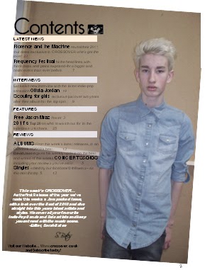
Here shows my final Contents page. This is my favoutire page i have created, i am very proud of the final outcome and what it is portraying. I also feel this page successfully represents the genre Indie-Pop, and shows a clear house style throughout the magazine and on this page. I was also very confident with the chosen photography and feel the layout of the text is perfectly set to not over flow (linking to the minimal text discovered in my research), the image or page. Also with the image being so strong and represented of Indie-Pop no other images were needed and the way the image takes up the whole page reflects on the attitude of the target audience and how influential the image will be.
No comments:
Post a Comment