Wednesday 14 December 2011

New Final Product


After my marks being brought down last year, and not being sent of to be moderated i feel this year has given me the opportunity to develop and inprove my magazine just slightly again, to ensure i have the best possible magazine of which will give me a better mark this year.
Even though i feel my magazine double page last year was the best it could be, and personally preferd it being more simple, creating the artistic look i was going for linking to other magazines i had researched such as INDIE. I feel the changes i have made due to constructive critisism given means that i will gain more marks through icluding more magazine conventions onto the page, using a wider range of photos and models, and also a wider range of luring tecniques.

I am still very happy with my magazine, greatly enjoyed making it and hope the changes i have made will improve my grade.

Tuesday 13 December 2011

Other Slight Changes

I also thought I could use the opportunity to make other smaller changes to my magazine, of which after having longer to look back realising that some things could be tweaked to become more realistic as an existing magazine.

For example I have changed the price of the magazine. It was initially £1.89, however after re-looking into the prices of existing magazines and calculating average ratio's of price to number of pages I have therefore changed the price to £2.89. This meant I then increased the number of pages on the contents page giving a higher variety of numbers.

I also decided to slightly change the size of the bar code very subtly just out of choice and thinking it looked just that bit more realistic being slightly smaller, similar to the size on existing magazines.

These were the only changes I made to the Front and Contents page. As I already feel happy that the pages are up to the standard of a real magazine, and shown a wide range of skills to the best of my ability. Also as each code and convention on the page represent the genre and house style perfectly through simple yet effective layouts, colour schemes etc.

After this I focused on changing the double page spread. I am already very happy with the layout and photography used on these pages however, after being advised by teachers to look at including more images and a wider variety of models I as shown before chose to do this by including an album advertisement, seen in other existing magazines. Also the bottom of the page, even though it was apart of the photography it still could be classed as a 'white space'. After moving this picture slightly up to create room for the Album I have created. Of which I put an caption next to it, again in the same font to keep to the house style. To add to the realism I then gave a rating of this, including stars I created myself on Publisher and then giving the rating from a highly regarded rater for all genre's of music, The guardian.


Alongside this strip i then had to fill in the gap i made. In this i decided to create another popular technique within all magazines which is an a lure. This is something to engage the reader into the magazine more, in this case making the reader go on to the next page. I chose to link into fashion and the style of the Genre to show more into delving into Indie-Pop covering all areas a Indie-Pop target audience would want to know, including the latest trends of their favourite artists. I purposly chose cream as a background colour, as i wanted it to blend into the muted colour scheme and style of this. I feel it gives a warmth of colour and a unity through the colours within the fontsi have used and photographs i have took. Also allowing it to stand out from the article but not out stand it. This links to the plug i put on the other side of the double page spread, again to show a flow using the same colour, luring the reader into more involvment with the magazine in this case through links to their website.


The final thing I changed on the page was adding in more to the Interview with the artist. This was because i felt having the font at 11 even then may have been a bit too big, compared to real magazine, so therefore changed in to 8 and used the spare space to include more questions. I looked back into the interview i had already made and identified other things i may not have covered enough or covered at all. Maintaining the same style and formality as my previous questions.


Album Advertisement

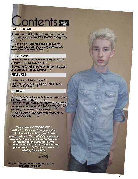
After researching and decided on an Album advertisement as a good way of including more images/models, I have decided to take an image of another school friend who volunteered to be a model for me in this, of whom again I chose to fit within my style and genre, again focusing on wardrobe, hair, make-up and pose etc.

However firstly I researched into existing album covers to gain an initial knowledge. Here i collected a few images of these to develop this...

After looking at images of initial album covers, I have viewed a range of styles and effects of the appearance of a cover, and its importance on how it is the portrayal and exposed advertisement for the whole album itself, revealing it to be a crucial participation to the campaign and sales of any artists latest tracks.
I then went on to look into 'Indie' artists album covers. As it being the genre of my magazine, using similar styles and replicating conventions of these will ensure what i make would surpass as a suitable Indie album.

Within these images, the use of subtle muted colours shows to be apparent through not only Indie magazines but throughout all of an Indie artists work. Again photography and art work seem to be a crucial part within the appearance of the covers, showing focus on using Indie models, through pose, wardrobe, setting etc (all things I have identified I need to consider). Also a majority of the Covers, have a photograph of the artist on the cover. This shows to be an effective way of branding the artist through all different types of media conventions such as album covers, magazine's, and other products e.g perfume. The titles of the album's are again simple, and show to have link to the artist for example, 'Bright Lights' by Ellie Goulding, is a catchy and 'cool' title, of which would be suitable for the age group of her target audience.

After taking a few shots I decided on this image to be used within my magazine...


I chose this image, because again it has a natural saturation within the colours, which is a convention of the 'Indie' genre, Also because of the lighting effects and how a spotlight effect was created from the flash, it also represents other album covers well and could defiantly see it used on an existing album. The subtle pose gives an effect engaging final image, which i would also be happy with to put alongside my original images and feel they would suit well and not look different styles. I specifically chose this image, as i feel the simple background wont over shadow or clash with the other images on the page, and the close up of the model, showing emphasis on it being their album cover and linking to close ups of existing artists album cover shots.

The first thing i did to the image was decide on a name for the album. After considering my research i gained going back to the Ellie Goulding comment, i decided on a choice of two: Young Love and Loosing Faith. Both simple and catchy, suitable for the artists target audience of a younger age group and effective for an Album. However i feel 'Young Love', is the stronger choice, of which i can now go onto making the title for it.

I chose to make the title simply through 'Publisher', text box, as within my research simple fonts and colours were used as titles. However changing the font to suit the style and image I feel is necessary. I also gave the artist a name, I chose Imogen Maher asb I feel it was a cool and quircky name suitable for an Indie artist.


I then experimented with the fonts available within Publisher, of which I finalised on Monotype Corsvia. This was a simple font yet still giving that edge, suiting the artist and there personality coming through within the image, being an innocent flirty and 'girly' looking style font, of which also links back to the Indie genre and the title of the album 'Young Love'.


After choosing a font, i also experimented with the colour of the photo. Black and White has always been a traditional and common way of making something look more Indie or to generally give it more of a style/ interesting photographic look. However as I have to consider my original images I feel a black and white image amongst them may stand out a bit too much so will use the more effective colour shot.

 I then decided on changing the colour of the title. Just to add another interesting and engaging feature to the Cover. The colour red is what most people would commonly associate with the word 'Love', so I created the font of just this red, as an experiment to see what it would come out like. I really like this change to the Cover and feel it an effective way of making it more interesting with even more uses of skill and knowledge developed into, yet still reflecting the laid back simple look.

I then decided to add a bare code to the cover, a few of the covers I researched showed to have bar codes at the front, of which i thought i would include onto mine just to add another convention to the cover, adding to the realism, and effect or it being an existing magazine including in this case, an existing artist with a real album. I then chose to place it in the corner not distracting from any key features of the Album eg the photo or the title.


I also discovered through research other conventions to include, were things such as 'Volume 1' or 'Volume 2' etc. In this case I decided to make my artist a new and recent artist and inclue a Volume 1, of which would be the first half of a double album. I decided to put this on the edge of the cover again to keep focus on the key features.
Here is a picture of the final Album Cover I have created of which I will put on my Original magazine...


Re-Submission Changes

 As I have decided to re-submit my coursework for AS level media, to get the best possible grade I can achieve I have decided to take the opportunity to tweak and change a few things on  my original 'Final Copy'.

Firstly I have decided to add more of my photography into my magazine. to show a wider range of skills and to use a wider use of models. However i had the issue of adding more than one or too many pictures on one page, would affect the house style and genre my magazine represents. As I focused clearly on replicating the same sort of genre as the successful magazine 'INDIE', this shows evidence of the genre and style being over simplistic, focusing on the artistry of an image and the creative but simple layouts within each page. Here are more example pages of the magazine i have re-researched to find ways of adding more images without taking anything away from the representation of the genre...


After looking more into this specific magazine and others within the genre 'Indie', it has given me inspiration and ideas influencing theirs on which i could take myself. As i still have to stick with the simple House Style, i have decided a good way of including more photography into my Magazine whilst at the same time including more conventions of existing magazines would be to include an album advertisement.